


Colour me happy
 With drab beige, cream and brown seemingly the most popular colours for office walls in the UK, it’s no wonder that office workers feel tired and uninspired. When it comes to walls, clothing pens and paper it seems that office professionals are getting the blues.
In an internet survey of 1,000 office workers, inkjet printer consumables company Jet Tec, found that the colours of clothing, pens, paper, documents and even walls, have a massive impact upon the mood of the average worker.
 According to the survey, nearly four out of ten offices in the UK are painted the same uninspiring beige hues seen in the stereotypically dull workplace on TV series The Office.
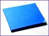
When asked which colours they would prefer, 40% of respondents opted for blue, defining it as a calming colour, providing a good atmosphere in which to work.
 It’s no surprise that blue was a popular choice, as the colour is linked to nature and renewal, according to David Lewis, a psychologist who presented the BBC programme The Colour Eye. Blue is the colour of a cloudless sky and has been shown to have a significantly calming effect, helping people cope with the stresses and strains of working life more effectively.
 The colour of printed documents also work upon a mood, and a mammoth 80% of respondents admitted that a document printed in colour would grab their attention and make them more likely to concentrate, although printing in red should be avoided as every single respondent felt that it reminded them of something being corrected at school!
 Blue was again the most popular colour for printed documents, with 52% of respondents saying that it conveyed a sense of fun or humour.
When asked which colour suit they like most for work and why, surprise, surprise, 34% opted for dark blue as it was smart, and a good alternative to black.
 William Studholme, managing director of Jet Tec said: “We have been aware for some time about the impact colour can have on a mood. The fact that the same colour applies throughout clothing, décor and printing is very interesting, and presents a clear message to directors – it’s time to apply the right colour to the office life.


