
Page 22 - PA_Enterprise_May-2022
P. 22
PAE
your report, and it can help you create an
outline. For example, you might create an
analytical report to determine why sales have
been lower than usual. You’d use this issue
to conduct research, collect data and propose
solutions. To identify an issue or question for
your report, try looking at how your company
is currently performing.
2. Gather relevant information
Once you identify your issue or question, start
gathering relevant information. This could
include data or resources. If you’re making
an analytical report about market trends, then
you might study your industry’s current market can add other elements, such as images and
or how competitors are performing. You could icons. These can help your chart be easier to
even read credible articles that are related read and look impressive.
to your report’s topic. Inquiry informs your
analytical report, so it’s important to conduct 5. Use design practices
accurate research. Once you’ve added your charts and other
elements, start designing your report. While
3. Choose a format you can make your analytical report as simple
Now that you have the groundwork for your or complex as you’d like, it’s important to
analytical report, you can choose a format for it. use design practices. These guidelines help
There are several ways to present an analytical make your report visually appealing and
report, such as a spreadsheet, document or easy to read. For example, a common design
presentation. Another popular option is an practice is to use a layout that’s clear, with
online dashboard. An online dashboard allows a mix of visuals and text. Another practice is
you to create and display charts in a way that’s to use plenty of white space to improve the
easy to understand. Try to select a format that readability of your report.
can present all of your data.
6. Make recommendations
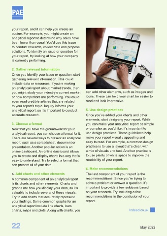
4. Add charts and other elements The last component of your report is the
A common component of an analytical report recommendations. Since you’re trying to
is its charts and other elements. Charts and solve a problem or answer a question, it’s
graphs are how you display your data, so it’s important to provide a few solutions based
valuable to include several of these visuals. on your research. Try including a few
Try to add charts that accurately represent recommendations in the conclusion of your
your findings. Some common graphs for an report.
analytical report include line charts, bars
charts, maps and plots. Along with charts, you Indeed.co.uk
22 May 2022